![]()

How to Select the Perfect Wedding Color Scheme.
Wedding color is one of the most impactful factors in wedding design. It establishes the mood, frames the aesthetic, and shapes the immediate emotional impact of the wedding. The right color palette is also critical to bringing all of the visual elements together and ensuring a beautiful, cohesive aesthetic at the celebration.
How Color Shapes the Wedding
The colors used in wedding styling dictate the visual experience of the entire event. The color theme connects all the different visual elements of the wedding, from the ceremony setup to the details and decoration of the wedding reception.
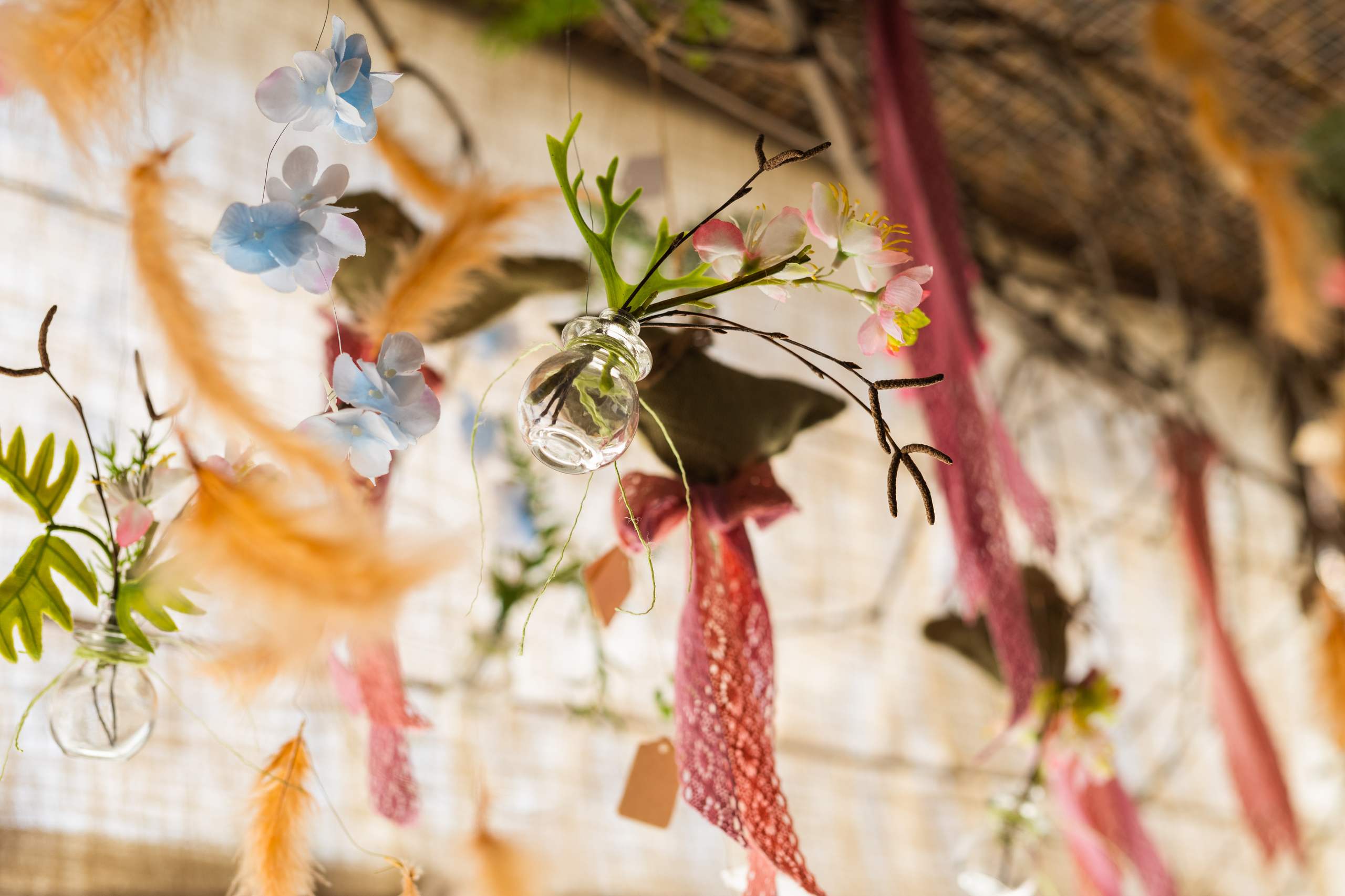
A pastel color palette evokes a tender and romantic tone, whereas bright, vibrant shades and bold, contrasting combinations lend themselves to a more modern and expressive wedding. Having the right color scheme will help you capture the couple’s mood and make it a visual story, and without color harmony, even a gorgeous wedding may not feel like it truly comes together.
Define the Right Color Palette for the Couple
The most successful color palettes always start with the couple’s needs, style preferences, and story. For some couples, the choice may come naturally, while others may turn to seasons, destinations, and feelings for their inspiration.
At this stage, the wedding stylist needs to help narrow down the ideas into a cohesive color plan. It is much better to have a more curated and limited palette that communicates the desired theme rather than a jumbled array of too many colors. This helps to provide focus and avoids visual over-stimulation.
How to Organize the Color Palette
Professional wedding styling palettes typically use three main tones:
- Main color (primary shade that is the focal point of the design)
- Supporting color (color that provides a supporting role)
- Accent color (used as an accent, in particular)
The three-color approach ensures that the color scheme works together visually but allows for flexibility and a range of shades within the design. It also allows for a clearer application of the color across other wedding aspects, such as floral design, textiles, lighting, or print elements.
Classic Wedding Palette Pairings
While you can select a wide array of different combinations, some color pairings have endured over time because of their flexibility to suit a wide variety of weddings.
Ivory & Gold
This combination is a perennial favorite for a more formal and opulent wedding look.
Blush Pink & Sage Green
The soft and gentle color combo is a popular choice for romantic weddings, especially outdoor weddings.
Navy & White
A contemporary and clean palette that is ideal for formal weddings or those with a minimalist theme.
Terracotta & Tan
A natural and warm palette suited to rustic or boho-chic inspired weddings.
Factor in the Seasons
Consider drawing on the season to help you choose your colors, because seasonal trends can have a large impact on color selection. Certain colors naturally fit within different seasons.
Pastels and greens for spring, bright colors for summer, earthy tones and browns for autumn, and lighter neutrals and deep, rich jewel tones for winter. Working with seasonal colors makes the wedding color choices feel more natural and in sync.
Sample Color in Fabric and Floral
Before finalizing your color palette, it is essential that you test your chosen colors with real samples and materials, whether this be fabric swatches, florals, or other printed items.
Because digital images and real color samples look different in person and under different lighting conditions, it is important to actually see how your color palette comes together. A physical mood board helps you get a sense of how all the different pieces will fit together within the physical space. This is the best way to avoid issues and make sure that all your colors are consistent across the wedding decorations.
Use the Same Color Throughout the Wedding
Once you have selected the colors, be sure to use them consistently through all the styling, from the ceremony and reception setup to the flowers and table settings.
If you include color in more than one place, that will contribute to the overall consistency of the wedding theme. You can introduce small accents, but the main colors should be the same throughout. It is the color consistency that will turn simple decorations into an intentional, designed wedding look.
The Takeaway
Creating the right color palette is essential to building a stunning and harmonious wedding. A well-crafted color scheme, grounded in emotional resonance and the use of a systematic, structured color approach, can help wedding stylists create designs that are as refined as they are personal. Using color thoughtfully takes an otherwise mundane decoration plan and brings the wedding into a fully-fledged aesthetic narrative.